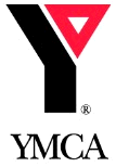
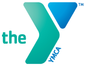
As designers, we love watching as organizations change their logo and branding. This week, the YMCA announced that it was changing its logo and will now be known simply as “the Y.”
 Branding experts called it a positive move and reflected the nickname that the organization’s members actually used. “Catching up with their customers” one pundit said. Others were a bit wary. Remember, the Y was started 166 years ago as the Young Men’s Christian Association. They got even more nervous when they saw quotes like this:
“I think [the new branding] is going to better reflect the vibrancy of the organization and the diversity of the communities we serve.” – Louie Warren, president and CEO of the YMCA of Greater Omaha
Never fear. Warren added, “Christian principles have always been a part of our strong heritage, and they will continue to be a very relevant part in the future.”
 Personally, I like the new look and color scheme. It feels fresh, and the tilt to the Y gives the logo forward movement. The old logo looks like a girder in comparison.
I wish they had had the nerve to cut out the “YMCA” at the bottom of the Y. I’d be willing to bet that was the subject of many hours of meetings and like most design compromises, yielded a weaker end product.
Tags: Louie Warren, new YMCA logo, YMCA
